Her employee barely used the POS. The reason took three words.
A small food and drinks shop, a free app downloaded online, and the most useful UX review I have ever heard.
The owner of Tokacha Food and Drinks runs a small shop selling drinks, snacks and home-cooked meals. A while ago she downloaded a free point-of-sale (POS) app. It was free, it had all the features, and it promised to keep track of sales and stock.
Weeks later, her employee was barely using it. So the owner asked her why. The answer came without a second of doubt.
“Too much tapping.”
Her employee, behind the counter
Why staff don't use a POS system: three words, a complete UX review
I keep coming back to that answer, because it is so precise. She wasn't lazy. She wasn't untrained. She was doing her job, and the app made her job slower. It is the most common reason employees don't use new software: it costs them time instead of saving it.
Picture her day. A customer is waiting. Another one is filling in a paper order slip. She takes cash or GCash, calls out names at the counter, cleans, sorts, and does it all again. Every extra tap sits between her and the next customer.
So she did what any sensible person does with a tool that slows her down. She went back to paper. And the free app quietly became a cost.
What “free” cost the shop
When a system isn't used, nothing breaks loudly. It goes wrong quietly.
None of that shows up on a price tag. It shows up in the evening, when the owner is tired and still doing the sums.
Software nobody uses isn't free. You pay for it in your team's time and in the numbers you can't see.
Designing a simple POS for a small café
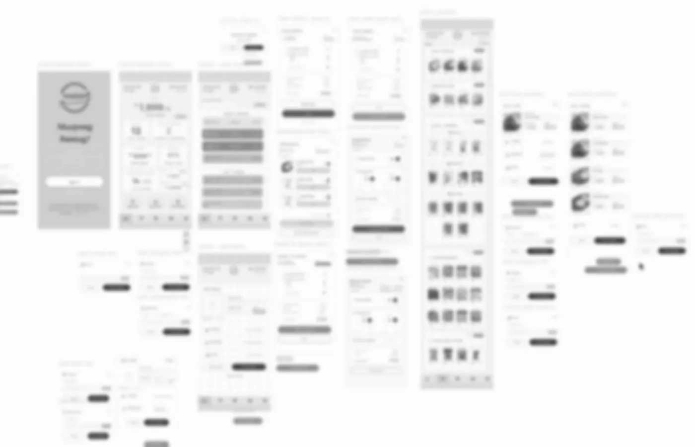
The owner asked me to build Tokacha its own POS. I started with the person who said “too much tapping”, not with the feature list.
Taps for one 3-item cash order
Estimated from the design plan. I will share the measured count after launch.
This is the plan, not the result
I am curious, and a little nervous, to see what happens when the tablet is on the counter and the queue is real. Designs look clean in Figma. Behind a busy counter they get tested properly for the first time.
So I will come back with the real numbers: how many taps an order takes, whether the employee actually uses it, and what we changed after the first week.
One question for your own team
You don't need a new system to learn from this. Ask the people who use your tools every day one question:
“Which part of our system do you skip?”
Their answer is your UX audit. It costs nothing, and it is more honest than any dashboard.
Curious what your team skips?
Let's look at it together. A short call, no strings attached.